
In a previous automation blog I discussed how to use Power Automate to obtain certain end-user metrics of a Virtual Desktop Session. In this blog we will discuss the digestion of those metrics and how to use Power BI to help automate our decision making process. Let’s get automating.
Dashboards aren’t anything too treacherous, but let’s take a look at a few items that take our data to the next level. First off we have an overall score that we can calculate. This provides us a good average baseline for our user experience month over month:
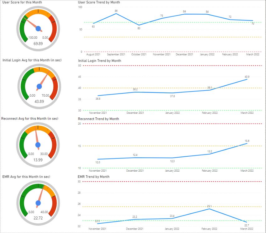
The Dial Gauge above is available in the Visualization market (CloudFronts Technologies LLP). Each trend above is used to make up the top level User Score. Lets take a look at how that is being calculated
We have to define the following values for the gauge: Max, Target Start, Target End, Actual Start, Actual End, Pointer Value. In my case these are defined as follows:
- Max = 100
- Target Start =66.6
- Target End = 33.3
- Actual Start = 100
- Actual End = 66.6
- Point Value = Overall UX Score which is calculated as follows
Overall UX Score = ((connectionTime[Cal_InitialLoginUXScore]) + (connectionTime[Cal_RetapUXScore]) + (connectionTime[Cal_EMRUXScore]))/3For each one of the components that funnel into your score, I perform the following to ensure we don’t go past a defined floor or ceiling.
Cal_InitialLoginUXScore =
VAR CoreMeasure = [InitialLogin UX Score]

RETURN

IF(
CoreMeasure>100, 100,
IF(
CoreMeasure<0, 0,
CoreMeasure
)
)
Let’s drill into one of the scores: InitialLogin UX Score
InitialLogin UX Score = (100-([Base_Initiallogin]-30)*2.5)This computes the weighted amount of the score ad we do this for each component of the UX make up:
- InitialLogin UX Score = (100-([Base_Initiallogin]-30)*2.5)
- Retap UX Score = (100-([Base_Retap]-10)*10)
- EMR UX Score = (100-([Base_EMR]-23)*14)
Play around with the dials, and come up with your own weights to make this work for you. If you are reporting on locations with physical address you can display that very nicely thanks to the Map visual
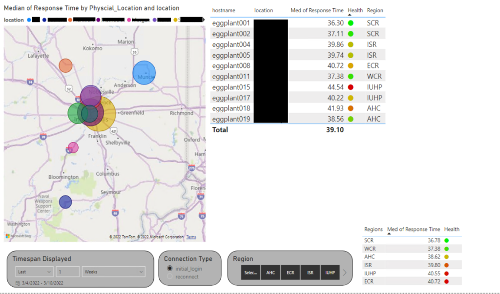
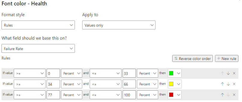
Notice we have some health metrics displayed. You can easily define this by way of a font color conditional formatting. More on this later. This just provides a quick visual for in terms of median comparison.
Health = UNICHAR (11044)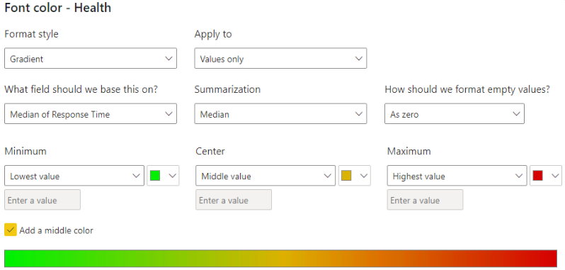
We can also obtain some other helpful data. We base our VM naming off of data center and pod which makes this all quite convenient e.g., zpwhzn1p2e0121.domain. Let use the transform tool to extract what we need. This will allow us to isolate what we need and obtain 2 parts of data ZP will be our data center and p2e0 will be our pod and block. This paves a way for the following:
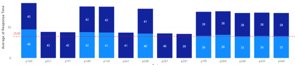
We can create a similar graph for the Datacenter, but you get the point. Next, lets talk about monitoring the health of the machines. We can easily do this again by understanding the count of responses and the outcome. Success vs Failures.
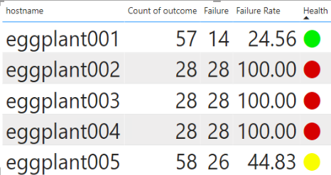
Counting Failure as follows
Failure =
CALCULATE(
	COUNTA('connectionTime'[outcome]),
	'connectionTime'[outcome] IN { "Failure" }
)
Getting a rate
Failure Rate =
VAR __BASELINE_VALUE = COUNTA('connectionTime'[outcome])
VAR __VALUE_TO_COMPARE = [Success]
RETURN
	DIVIDE(__VALUE_TO_COMPARE - __BASELINE_VALUE, __BASELINE_VALUE) * (-100)
Same as our health check before we can set the font color on a conditional. This time we base it off a percentage of the failure.
If anything I hope this has provided you some brain food to help get the gears going. The possibilities are endless. In future blogs, I will help tie this data into data driven alerts and firing off ITSM alerts based off of health status and other factors that would call for action.